Showing posts with label customize. Show all posts
Showing posts with label customize. Show all posts
Friday, October 28, 2016
Customize Blogger Labels With CSS3
Customize Blogger Labels With CSS3
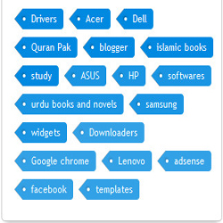
How can you add labels in bloggers blog?
- Log in to your blogger account.
- Click on blog title in which you want to add This Subscriber box.
- Go to layout and then click on Add a Gadget.
- Select label and set your label style to cloud and hit save.
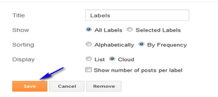
Customization:
- First go to your blogger template
- Click on edit and check expand widget box
- Then click ctrl+f and find ]]></b:skin>
- Just above it paste the below code.
/*----- KH LABEL STYLE START-----*/
.label-size{
margin:0;
padding:0;
position:relative;
}
.label-size a{
float:left;
height:24px;
line-height:24px;
position:relative;
font-size:12px;
margin-bottom: 9px;
margin-left:20px;
padding:0 10px 0 12px;
background:#0089e0;
color:#fff;
text-decoration:none;
-moz-border-radius-bottomright:4px;
-webkit-border-bottom-right-radius:4px;
border-bottom-right-radius:4px;
-moz-border-radius-topright:4px;
-webkit-border-top-right-radius:4px;
border-top-right-radius:4px;
}
.label-size a:before{
content:"";
float:left;
position:absolute;
top:0;
left:-12px;
width:0;
height:0;
border-color:transparent #0089e0 transparent transparent;
border-style:solid;
border-width:12px 12px 12px 0;
}
.label-size a:after{
content:"";
position:absolute;
top:10px;
left:0;
float:left;
width:4px;
height:4px;
-moz-border-radius:2px;
-webkit-border-radius:2px;
border-radius:2px;
background:#fff;
-moz-box-shadow:-1px -1px 2px #004977;
-webkit-box-shadow:-1px -1px 2px #004977;
box-shadow:-1px -1px 2px #004977;
}
.label-size a:hover{background:#555;}
.label-size a:hover:before{border-color:transparent #555 transparent transparent;}
/*----- KH LABEL STYLE END-----*/
Note: if you want to change the color of your label chose your color and replaces it with #0089e0 And changing shadow effect then change this one #004977
Finally save your template you are done.
Go to link download

Tuesday, September 20, 2016
Customize Bloggers Official Popular Posts Widget
Customize Bloggers Official Popular Posts Widget

JavaScript always increase page load time and also increase bounce rate of your blog. And also we are using widget stored in blogger server and we just alter its look and shape to make it blend with your BlogSpot.
I hope you will find today tutorial pretty
interesting. Always write a comment to shear your suggestion. So now let’s go to plying with these beautiful widgets.
interesting. Always write a comment to shear your suggestion. So now let’s go to plying with these beautiful widgets.
Adding popular post widget in to your blog!
- Log in to your blogger account.
- Click on blog title in which you want to add This Popular Post widget.
- Go to layout and then click on "Popular Post" gadget from the list provided
- Now make these settings

Now Hit save. and search for
]]></b:skin>
- Just above it paste the following code.
/*** KH Popular Post ***/
.popular-posts { margin: 10px 0px 5px 0px;}
.popular-posts ul{padding-left:0px;
font: normal 13px Arial, Tahoma, Verdana;}
.popular-posts ul li {background: #fff
url(https://blogger.googleusercontent.com/img/b/R29vZ2xl/AVvXsEjxkR3I5lTUJKhlBVT73FrbIRGSY6Bsdz-M4QH1NeKCD_VvKR98QYol-4ss8ulZdejW7xzeKDVzwKpr-WUQV1ZvWfriV3RjnEmhDI7Yi4qtn1C2CEbwCyepmCL6g7BjYrl18gukAatCBAg/s1600/kutebkhana.png)
no-repeat 2px;
list-style-type: none;
margin: 0 0 5px 0px;
padding: 5px 5px 5px 30px !important;
border: 1px solid #007D47;
border-radius: 10px;
-moz-border-radius: 10px;
-webkit-border-radius: 10px;
}
.popular-posts ul li:hover {
border:1px solid #80FEC8;
}
.popular-posts ul li a:hover {
text-decoration:none; }
Customization!
- To change the bullet image replace the image link in Red in the code above with your bullet URL.
- To change the border colors in active mode edit #007D47
- To change the border colors on mouse hover edit #80FEC8
Use Our Hex Color Code Generator For Choose Color
Go to link download
Subscribe to:
Posts (Atom)