Showing posts with label text. Show all posts
Showing posts with label text. Show all posts
Monday, October 31, 2016
How to make CSS3 keyboard like text effect in blogger And Website Post
How to make CSS3 keyboard like text effect in blogger And Website Post
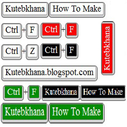
How can you add keyboard keys effect in your blog post?
- Log in to your blogger account.
- Click on blog title in which you want to add This Keyboard Like Text Effect
- Go to Template and then click on "Edit HTML" Check Expand Widget Box..
- Now Find bellows code Using Ctrl+F Function.
]]></b:skin>
- Paste bellow CSS Code just above this ]]></b:skin>
Code for White color Keyboard Keys
KKW{
border:1px solid gray;
Background: #ffffff;
font-size:1.2em;
box-shadow:1px 0 1px 0 #eee, 0 2px 0 2px #ccc, 0 2px 0 3px #444;
-webkit-border-radius:3px;
-moz-border-radius:3px;
border-radius:3px;
margin:2px 3px;
padding:1px 5px;
}
Code for Black color Keyboard Keys
KKB{
border:1px solid gray;
Background: #000;
font-size:1.2em;
box-shadow:1px 0 1px 0 #eee, 0 2px 0 2px #ccc, 0 2px 0 3px #444;
Color:fff;
-webkit-border-radius:3px;
-moz-border-radius:3px;
border-radius:3px;
margin:2px 3px;
padding:1px 5px;
}
Code for Red color Keyboard Keys
KKR{
border:1px solid gray;
Background: #FF0000;
font-size:1.2em;
box-shadow:1px 0 1px 0 #eee, 0 2px 0 2px #ccc, 0 2px 0 3px #444;
Color:fff;
-webkit-border-radius:3px;
-moz-border-radius:3px;
border-radius:3px;
margin:2px 3px;
padding:1px 5px;
}
Code for Green color Keyboard Keys
KKG{
border:1px solid gray;
Background: #008E00;
font-size:1.2em;
box-shadow:1px 0 1px 0 #eee, 0 2px 0 2px #ccc, 0 2px 0 3px #444;
Color:fff;
-webkit-border-radius:3px;
-moz-border-radius:3px;
border-radius:3px;
margin:2px 3px;
padding:1px 5px;
}
Settings!
You Can Change highlighted code for change your keyboard background color. (Choose color From here)Using in your blog post and pages
Please replace Write Your Word Here With Your Word!For Black:
<KKB> Write Your Word Here </KKB>
For White:
<KKW> Write Your Word Here </KKW>
For red:
<KKR> Write Your Word Here </KKR>
For Green:
<KKG> Write Your Word Here </KKG>
If you have any Kind of questions about this post, please lave a comments bellow.
Do not forget to share this Post with your friends!
Go to link download

Monday, October 3, 2016
10 awesome photoshop text effects tutorials
10 awesome photoshop text effects tutorials
Today I’m going to provide some awesome Photoshop text effects tutorials for those who are habitual of design high quality & creative typography stuff. Using this tutorials you will be able to easily get ideas for design some awesome text effects. I hope you will must like this 10 awesome Photoshop text effects tutorials because i did some research on that and select only the best ones. Let’s checkout the list.
Combined Gold And Glass Text Effect
Tutorial Details
Program: Adobe Photoshop CS+Tools & Style: Layer Styles

Go to link download
Monday, August 29, 2016
CSS3 Zoom out text for Blogger
CSS3 Zoom out text for Blogger

It use some multiple text shadows in a gradient of colors.
You don’t have to be exact, and I quite liked the layered effect.
So all we gotta do is set a small text shadow for the initial state, which then becomes bigger on hovering, and then disappears.
We also want to keep the text in a constant position, so we’ll just use position: relative;.
I wanted to use transitions so it smoothly zoomed out, but webkit seemed to be the only browser that supported it properly, so I only used the webkit transition tag. It’ll work fine in the latest version of all other browsers.

The CSS
Add below CSS codes just above ]]></b:skin> in your Blogger template#text {We have used different colours for each, but you could very easily pick your own, or just use the same one for all. If you only use one shadow you won’t create the illusion of depth.
font-family: Tahoma, Helvetica, Arial, sans-serif;
font-size: 8em;
width: 100%;
text-align: center;
margin: 120px 0;
}
#text a {
text-decoration: none;
font-weight: bold;
color: #ffffff;
text-shadow: 0 2px 0 #721e1e, 0px 2px 5px rgba(0,0,0,0.5);
position: relative;
-webkit-transition: all 0.1s ease-in;
}
#text a:hover {
text-shadow: 0 2px 0 #d84f4f, 0 4px 0 #d54646, 0 6px 0 #ce3333, 0 8px 0 #b92e2e, 0 10px 0 #912525, 0 12px 0 #721e1e, 0px 12px 10px rgba(0,0,0,0.5);
top: -12px;
}
#text a:active {
text-shadow: none;
bottom: 0;
text-shadow: 0px 0px 7px rgba(0,0,0,0.5);
}
Usage
In your Blogger post editor HTML mode you have to customize and paste below codes<div id="text">And that’s it! Check out the Preview! Thanks.
<a href="#">SOME ZOOM TEXT</a>
</div>
Go to link download
Subscribe to:
Posts (Atom)